


The Power of Stories
The Power of Stories celebrates the work of one of Britain’s most pioneering and influential authors, Malorie Blackman. The exhibition shows storytelling in a tactile form, diving deep into topics such as social division, power imbalance, and oppression, which are foundations for many of Blackman’s novels.
The headline typeface used in the exhibition is called Martin by Vocal Type and is derived from placards used in the Memphis Sanitation Strike of 1968. The commanding font is cut from acrylic and mounted on rails announcing each of the four sections of the exhibition.


Power Up
Signage and interpretation for Power Up – a permanent gaming space at the Science Museum.
In collaboration with Sam Jacob Studio


South Norwood in Print
Who gets to write the history of a place? How can a diverse set of voices be gathered, preserved, and shared in order to become part of the heritage of a place?
We led two workshops at Harris Academy in South Norwood. The students were asked to share personal stories about the local area and to represent that story through an object of their choosing. The objects were then inked up, using printing rollers, and printed onto paper.
The stories that the children shared ranged from personal anecdotes about their favourite place to eat on the high street to their thoughts about the renowned rapper who once went to their school.
Squeeze, ink, roll, compose, position, press, peel, carry, careful, lay, wash, reflect, adjust, repeat … we would like to say a special thank you to the students of Harris Academy South Norwood who took part in the printing workshops and the Harris staff who made it possible … smudge, mess, hands, clothes, miss, tear, drop, bin … you worked through it and produced many beautiful prints, a selection of which we are delighted to present here in this publication.
In collaboration with CarverHaggard and Tanguy Bertocchi
Photography by Jas Lehal, Yusuf Islam and CarverHaggard
Thank you to all the workshop participants: Oritseseyisan, Abdullah, Alesha, Hayleigh, Taye, Suzannaz, Harry, Ugaas, Colin, Cillian, Tia, Adam, Eshaan, Zoya, Hana, Gabriel, Shanise, Lily, Makhi, Lexie, Kopithan, Serah, Harmony


Community Clock Face
A clock celebrating the community of Whitchurch Lane in Harrow, London.
In collaboration with Shehzad Ahmed, Alka Maharjan, CarverHaggard and DK-CM
Photography by Jas Lehal and Yusuf Islam


Camden Green Loop
The Camden Green Loop is a collection of projects which link together new and existing green spaces in Camden. The graphic identity was developed with the local community through workshops.
Many of the participants talked about the layers of history and community which are so special to Camden. The borough was described as a melting pot of culture and activity. We wanted to pick up on these layers of identity and the idea that the borough is built out of different component parts.
The three parts of the word image take on looping forms and can be assembled in different ways. Through workshops with the local community participants were asked to bring in objects which allowed them to tell a story about Camden to the group. Silhouettes of these objects are incorporated into this identity giving an unexpected quality to some of the visual building blocks.


Spitalfields City Farm
City signs for the city farm.


Royal College of Art Graduate Show 2022
A visual identity that holds a dialogue about accessibility in design practice at its centre.
Our work for the Royal College of Art Graduate Show 2022 gave us a chance to think about accessibility and inclusion within design; what are the barriers faced by d/Deaf, disabled and neurodivergent students? What provisions can design provide to meet them? How do we design for a future that does not aim to eradicate disability but respects and supports a diverse range of needs? What does this look like in the context of presenting student work?
The design was for the Royal College of Art Graduate Show 2022. The identity was implemented in the form of signage, digital assets and printed matter. We worked with the writers and access experts Kaiya Waerea and Sophie Paul, to produce image descriptions which became part of the design work. Key inputs from RCA Neurodiverse Society and the RCA Disabled Students Network helped inform our approach, this included adopting Bionic Reading in the typesetting.
Please read more about the project here.
In collaboration with Kaiya Waerea and Sophie Paul
Photography by Thomas Adank


The Moorings Sociable Club
We designed the signage, wayfinding and graphic identity for the the Moorings Sociable Club in Thamesmead, together with artist Verity-Jane Keefe and the local residents through co-design workshops.
This included external signage and internal wayfinding as well as signage further away from the Moorings Sociable Club pointing you in its direction.
The typographical treatment of the graphic identity refers back to the original Moorings Social Club membership card. Throughout the project we have been keen to find inspiration in the the left over bits of the old social club and juxtapose these ideas with new ideas taken from the workshops that Verity Jane-Keefe and Daisy Froud organised with the current residents.
In collaboration with Verity-Jane Keefe, Daisy Froud, Josh Mallins, Kate Bachelor


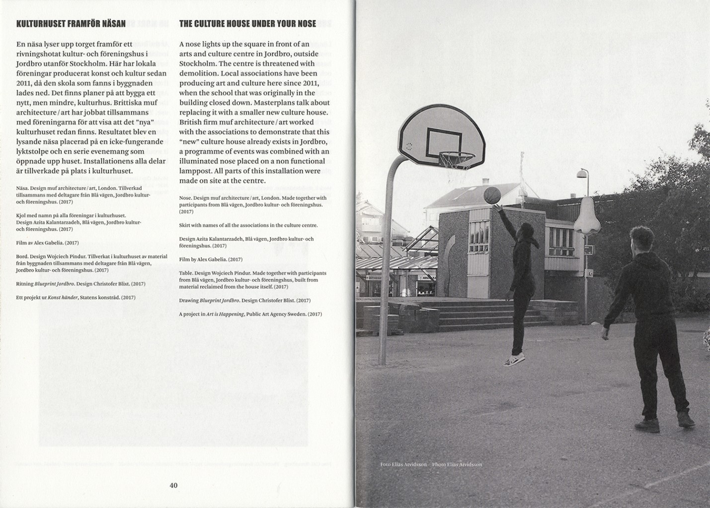


Public Luxury
Graphic identity and marketing material for Public Luxury – an exhibition on architecture, design and the fight for the public realm, at Arkdes, Stockholm.
We wrote a list of things which someone might normally think of as Public services and another for Luxury commodities and then we inverted them. This gave us some playful juxtapositions such as Public Bubble Bath / Luxury Street Cleaning or Public Hotels / Luxury Playgrounds. These posters went up in public spaces all around the city with the aim of challenging viewers to speculate on alternative possibilities for public provision.
In collaboration with Martin Frostner Studio
Curated by Kieran Long and Daniel Golling


Unmaking Democratic Design
Swedish design is somewhat synonymous with Ikea and its accessible design for the masses. Otherwise known as “democratic design”, the country is famed for delivering easy-to-use, cheap, flat-packed furniture to the rest of the world. Priding itself on an all-encompassing universality that provides everyone and anyone with affordable and ergonomic design, the notion of democratic design is synonymous with Sweden’s design identity. In a this exhibition by Fredrik Paulsen at the Röhsska Museum, Unmaking Democratic Design sees the furniture designer interpret his idea of democratic design through chairs.
Using pigments and dyes, Fredrik Paulsen’s approach to colouring wood is akin to that of a graphic designer’s to paper. By using special inks instead of CMYK, we have paralleled the brightness and vitality of the pure colours used by Fredrik – which would otherwise be dulled through standard CMYK colour mixing. Similarly, we have approached the design of the typeface with furniture in mind – trying to imagine a what if-scenario of Paulsen building the letterforms like he would his exuberant chairs.
Curated by Johan Deurell


Station Road Harrow
On Station Road in Harrow we used the language and techniques of road markings to design parade signage on the asphalt. The work addressed a lack of identity of place and solved some very practical issues such as retailers addresses getting confused due to a lack of signage. We couldn’t have pulled this off without the experience and skill of Roy and Dave who painted the road markings on site.
In collaboration with Mark Projects, The Means, Harrow Council


Unite Against Dividers
Unite Against Dividers was a weekend full of activities, debates and questions about how the arts should respond to the EU referendum result. We designed the graphic identity and printed implementations such as flyers, handbook, poster/placemats.
The second years programme of activities was named Organise with Others and the third iteration was called Make it Work.
In collaboration with Keep it Complex


Wealdstone Youth Workshop
Wealdstone Youth Workshop was a public design project for Wealdstone, northwest London. We collaborated with young people to design and make a range of public furniture for Wealdstone Square.
The workshop was made up of Esther, Leo, Kayleigh, Marina, Marius and Tanya – all 15 to 19 year olds from across the borough. Through a series of summer workshops the young people co-designed, prototyped and tested different pieces of furniture for the square. They were paid for taking part, and received a share of the intellectual property created.
graphic identity, art direction, website
In collaboration with Spacemakers, Silo Studio and We Made That


The Festival of Radical Fun
‘Do! Act! Share! Get together! Spend no money now! And, by doing so, you just might find yourself creating a London that’s radical and fun.’ This was the sentiment behind The Festival of Radical Fun, held at the museum of London on 7 October 2017. The museum was full of artists, designers, performers and writers considering how to change the city for the better.
We designed the identity and a publication for the day. In order to create as little waste as possible the programme is printed on reclaimed A4 paper, gathered (with a bike) from the recycling bins of libraries, schools and offices across London. This had the added benefit of making each copy of the publication unique.
Our headline typeface was inspired by the lettering for Franciszka and Stefan Themerson’s book cover of Exercises in Style.
In collaboration with Tom James


Rumors and Murmors
Rumors and Murmurs is a publication for the artist Martin Beck. It accompanies an exhibition of the same name at the Mumok in Vienna. The publication takes the form of a box containing essays, exhibition plans, Martin’s working files and representations of artworks.
In collaboration with Rasmus Spanggaard Troelsen
Published by Walther König


Ready Made Go 4
Ready Made Go is an annual exhibition of furniture and objects commissioned for the Ace Hotel in London. All of the newly designed products – such as tables, chairs, coat hooks and door handles – were then installed throughout the hotel on a permanent basis.
Our typographic identity for the show responds to its title by visually evoking a sense of movement in the letterforms. It’s as if the letters are accelerating through the gears. This in turn evokes a sense of industrial production which felt appropriate to the nature of the industrially produced products in the show.
Curated by Modern Design Review


Skinned and Detouched
Book design and editorial consultation for Skinned and Detouched – a pair of books by the artist Alice Channer. The books act as portals into the industrial production of two sculptures. Skinned uses the industrial process of metallic coating used in the production of car head lamps. Detouched uses the process of dipping metal into heated plastic use in the production of hand tools.
The books include texts by Jennifer Boyd which respond to the industrial processes through which the artworks are created. The type setting across the two books stretches and squeezes, plunges and withdraws in conversation with Jen’s text.
The text and images in Skinned are printed CMYK + silver to extend the metallic coating taking place in the industrial process.
Photography by Thierry Bal
Published by Eastside Projects and Motto Books


Park Life
Eastside Projects are interested in changing the way that art is commissioned for new property developments in the UK. Through this project they plan to initiate a working method that involves artists at a much earlier stage of development, so they can be part of the design and planning process.
The projects that they have commissioned are taking place in Longford Park, a new housing development in Banbury. They include: The Artist House by Heather and Ivan Morison; a model village in the form of birdhouses by Richard Woods; a heated outdoor cast-iron sculpture by Nicolas Deshayes; and a participatory budgeting process by Rosalie Schweiker.
Europa created a graphic identity and posters to announce the public art project using a bespoke headline typeface.


The Identity Façade
We were commissioned by Radar, Loughborough, to think about identity and place. Our research for this project became a text and a series of visual responses to the town. We worked on these with the artist and illustrator Peter Nencini. These responses exist as a set of billboards located in Loughborough and a series of images hosted on the website. Please visit the website www.oughough.uk to read the text.
In collaboration with Peter Nencini
Web development by Kieran Startup


This Is A Voice
Exhibition graphics and gallery guide for This Is A Voice at the Wellcome Collection. The exhibition focuses on the non-linguistic and experimental qualities of the voice represented through a variety of objects and artworks. The title graphics were treated in a playful way – visually interpreting the theme of each section. Working closely with the 3D designers, a pallet of tactile materials were developed to marry the graphic and built elements. All text in the exhibition is printed on silicone – giving a fleshy layer on top of the exhibitions 3D skeleton. The gallery guide acts as an extended reader for the exhibition, offering more in-depth information on each of the works.


Pick Me Up
Graphic identity for Pick Me Up 2015 at Somerset House. Following the punchy three word title of the graphic arts festival we wrote a series of three word statements for the information panels and the way finding. Alongside this we asked the speakers of the critical programme to write three word statements which were then subject to the graphic treatment of the identity.
The graphic mark-making of the typography emulates hand-made placards and was fly-posted throughout on large format screen printed posters. Plywood lettering guides were cut on site with the help of Makerversity, who are located in the basement of Somerset house. These were then used to mark out the large format title graphics which were finished up by sign writers.
3D: Michael Marriott
Sign writing: Sean Thomas
Screen Printing: Oli Fowler


Blackhorse Lane Billboards
These billboards document and celebrate the industry and manufacturing in the Blackhorse Lane area in Walthamstow, London. These include a prop maker, specialist stone supplier, bespoke joinery manufacturer, wooden bed maker, comic book seller, metal fabricator and a fabric distributor.
In collaboration with photographer Thomas Adank and architects We Made That


Blackhorse Lane Industrial Estate
New wayfinding for the five industrial estates along Blackhorse Lane in Walthamstow. Reusing existing posts to save costs, the modular design allows flexibility and retains the possibility for additional smaller signs to be added at a later date. In addition to the signage we designed a new clock at the heart of the industrial estate.
In collaboration with We Made That


Building Rights
Launched in April 2014, Building Rights is a user-generated resource for knowledge and information about planning issues in England and Wales. It seeks to amplify and extend existing sources of knowledge available from the government and local authorities, and to increase popular engagement with the practice of planning. It seeks to increase every citizen’s knowledge of their building rights, and their ability to use them, whether they are seeking to build, to prevent building, or otherwise to play an active role in their towns and places. Building Rights is part of ‘Making Planning Popular’, a PhD by David Knight.
In collaboration with DK-CM and Afonso Martins


Southall Market Welcome Mat
New terrazzo entrance to Southall Market. Part of a wider project where we were working with Ealing Council to make interventions in the public realm in Southall.
In collaboration with DK-CM, Project Centre and Urban Movement


The Aspen Complex
The Aspen Complex draws on the events of the 1970 International Design Conference in Aspen, with documentary photographs of Martin Beck’s exhibition Panel 2 – Nothing better than a touch of ecology and catastrophe to unite the social classes…, essays by Sabeth Buchmann, Felicity D. Scott, and Alice Twemlow and video stills from the Aspen Movie Map.
The physical form of The Aspen Complex references another book – The Aspen Papers – in both size and material. The Aspen Papers, published in 1974, is a book edited by Rayner Banham and designed by Ivan Chermayeff. It contains official material collected from the Aspen conferences. The headlines in The Aspen Complex are set in Compacta, a typeface used in two relevant counterculture publications from 1970 – Radical Software and Domebook.
Designed with Rasmus Spanggaard Troelsen
Published by Sternberg Press


Breathing
This book was designed on the occasion of Alice Channer’s exhibition Out of Body at South London Gallery, using five different cuts of the typeface Univers. This book includes photographs from the exhibition, a selection of Alice’s past work, an essay by Barry Schwabsky and an interview conducted by Sam Thorne.
Published by South London Gallery


Parallel Cards
The Parallel Cards at first appear like a traditional pack of cards. On closer inspection, however, it can be seen that the playing cards have no reverse side but two picture sides – with a different card always appearing on the reverse.
We developed the game Parallel Black Jacks to be played with the cards. Card tournaments for the game have been held at Somerset House, Lisson Gallery and Berkeley Art Museum, USA.
In many traditional designs, including the designs that we were using, the front face of playing cards are printed with the spot colours blue, red, yellow and black. As these colours are not so far off of the standard printing colours – cyan, magenta, yellow and black – we printed not only the cards but the accompanying leaflet which included a photograph of twins playing with the cards.
For the second edition of the cards we inverted all of the colours on the cards.
Collaboration with Ryan Gander
Joker illustration by Sion Ap Tomos
MUMOK, The Thing Quarterly


Blackhorse Workshop
Blackhorse Workshop is a wood and metal workshop for making and mending in Walthamstow. The workshop provides affordable access to tools and workspace for the local community.
Photographs of signage by Agnese Sanvito